


A customer who reaches checkout has already decided to buy. The job at that point is not to get in their way.
That sounds simple, and yet, according to Statista, seven out of ten shopping carts are abandoned before purchase. Most of those drop-offs happen at the final step, over details that are specific and fixable.
So, what are the businesses that convert consistently at checkout doing differently?
What they share is a deliberate approach to what customers see, what they're asked to do, and how much effort each step takes.
The seven best checkout experiences below include both merchant checkout experiences and payment platforms that help shape the checkout experience. Each highlights a different lesson businesses can apply to improve conversion.
Key takeaways
- Most checkout drop-off is fixable
The biggest causes of abandonment, such as forced registration, missing payment methods, and unclear costs, are often small problems that can be fixed without rebuilding the entire checkout.
- Show payment methods before checkout
Customers want reassurance before they commit. Display accepted payment methods on product pages and in the cart, not only on the payment screen.
- Ask for account creation after purchase
Customers came to buy, not to create an account. Let them complete the transaction first, and offer account creation afterward.
- Answer objections before payment
Questions about delivery, billing, returns, or cancellation should be addressed before customers reach the payment step.
- Local payment methods matter
Customers are more likely to complete a purchase when they see payment options they already know and trust.
7 best checkout experiences at a glance
7 best checkout experiences worth studying (and one lesson from each)
The following examples each highlight one thing done particularly well at checkout. Use them as a reference when reviewing or improving your own checkout experience.
1. A payment layer built for local market preferences (Paypercut)
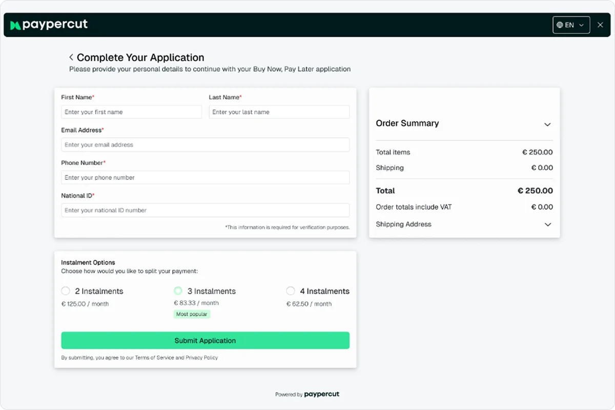
Paypercut is a payment platform built for businesses selling across Central and Eastern Europe.
Its strength is the ability to present customers with payment options that feel familiar in their market. Whether that's cards, digital wallets, local payment methods, or Buy Now, Pay Later options, the goal is the same: Reduce hesitation at checkout by showing customers the ways they already prefer to pay.
As merchants expand into new countries, payment preferences often change. What works in one market may have little recognition in another.
Instead of managing separate providers and integrations for each country, merchants can manage their checkout experience through a single platform while adapting the payment mix to local customer expectations.
BNPL is one example of this approach. Through Paypercut's BNPL aggregator, merchants can connect to multiple providers through a single integration and offer customers installment options that are relevant to their market, while receiving the full transaction amount upfront.
Why it works
Familiarity builds trust, especially in markets where payment habits differ significantly between countries.
The most effective checkout experiences don't force the same payment setup on every customer. They adapt to local expectations while keeping the merchant's operational complexity low.
The lesson
When expanding into new markets, don't assume customers will pay the same way they do at home.
Local payment methods, digital wallets, cards, and installment options all influence conversion. The more closely your checkout reflects local customer preferences, the more likely customers are to complete their purchase.
2. A well-designed checkout that builds confidence (ASOS)
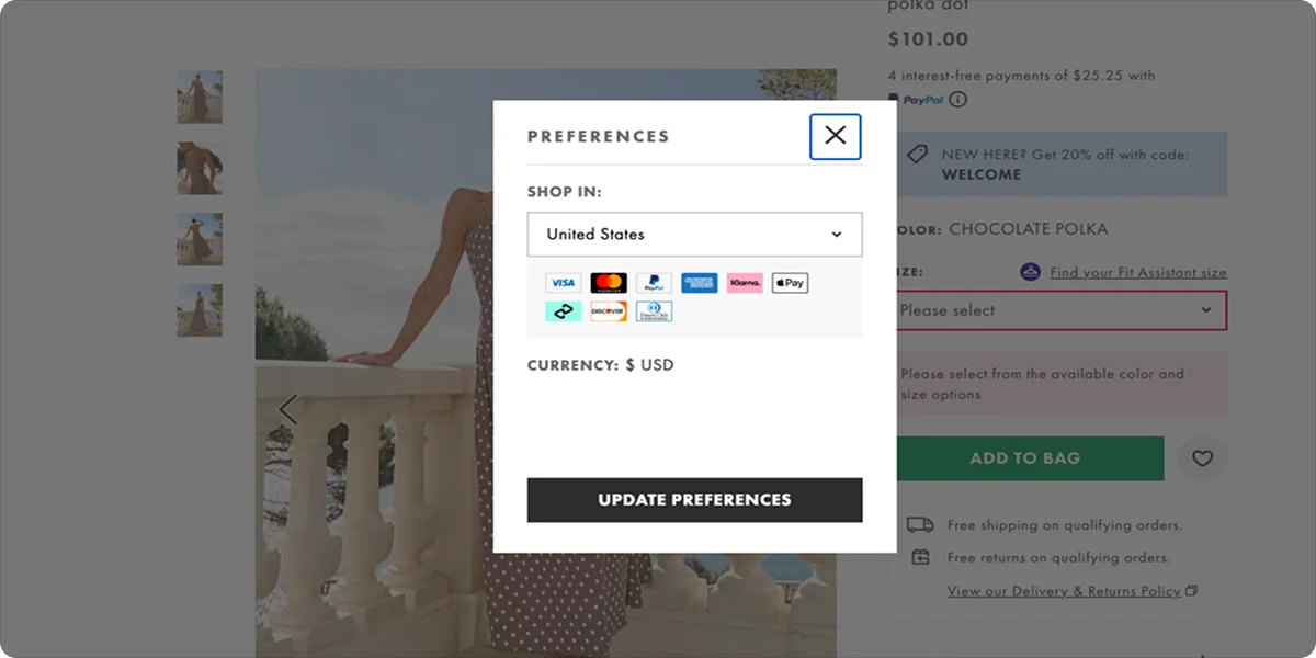
Knowing which payment options to offer is one thing. How you present them at checkout is another.
ASOS lays out payment options (cards, PayPal, Klarna) clearly before customers enter any details. The checkout page itself is clean: a persistent order summary on the right side, no elements competing for attention, and a form that asks only for what's needed to process the order. Nothing about the design creates doubt at the moment customers are about to pay.
Why it works
A checkout page that's hard to read or visually busy gives customers reasons to hesitate. When payment options are visible and the page is easy to scan, customers arrive at the payment step already knowing what to expect. That predictability is what keeps them moving forward.
The lesson
What you show and where matters, but so does how you do it. There are a few things worth getting right:
- For standard payment methods, logos are enough.
- For BNPL, showing the installment payments breakdown next to the price does more than a logo alone. It removes the price barrier at the moment when customers are still deciding.
- Make sure that the payment methods you list are actually available at checkout.
3. Guest checkout done right (LEGO)
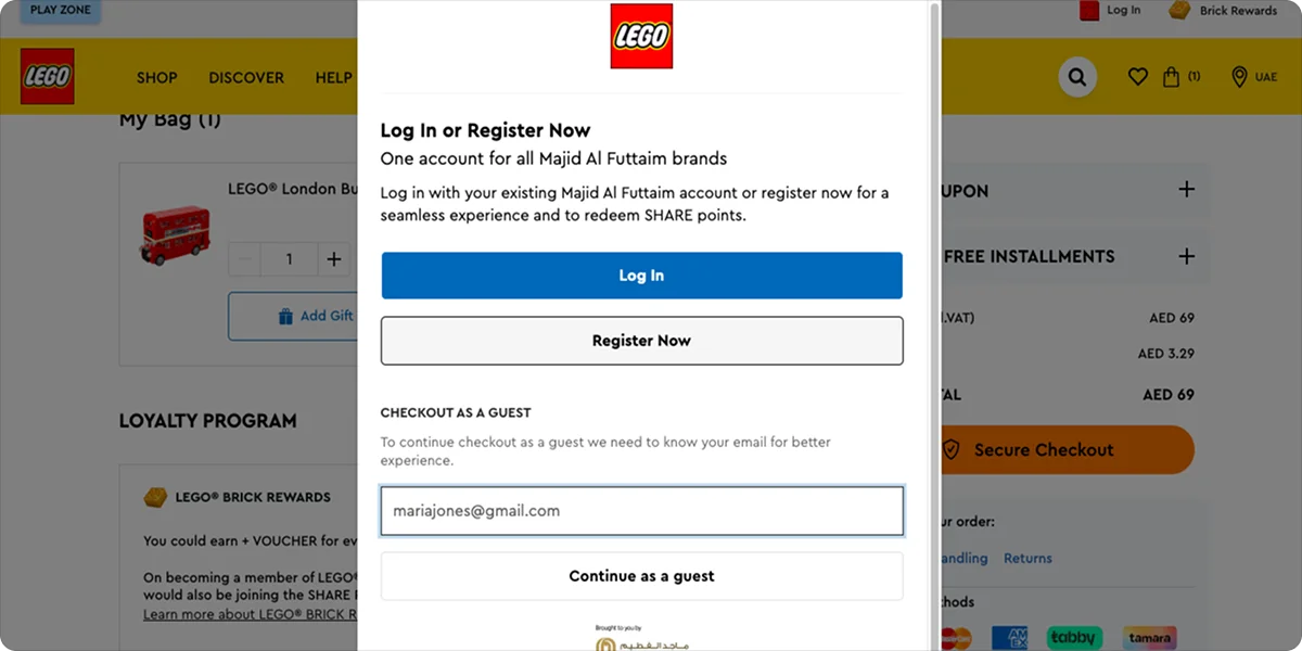
LEGO's checkout gives customers a clear choice upfront: Continue as a guest or sign in to access saved details and Insiders points. Both options are equally visible.
The copy explains what's in it for customers who register (order history, saved addresses, loyalty points) without making registration feel mandatory. Guests move straight through, while returning customers get a genuine reason to sign in.
Why it works
Forced account creation is one of the most documented causes of checkout abandonment. Around 26% of shoppers abandon a purchase specifically because they were required to create an account. The guest option doesn't mean losing customer data. Anyone who wants to create an account still can; it just stops being a condition of purchase.
The lesson
The right moment to ask for registration is after the purchase, not before it. At that point, the customer has already decided to trust you with their payment details.
4. Microcopy that guides instead of confuses (IKEA)
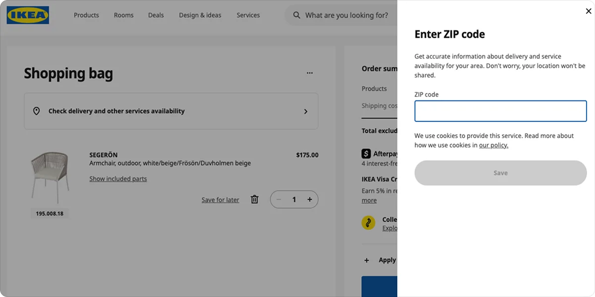
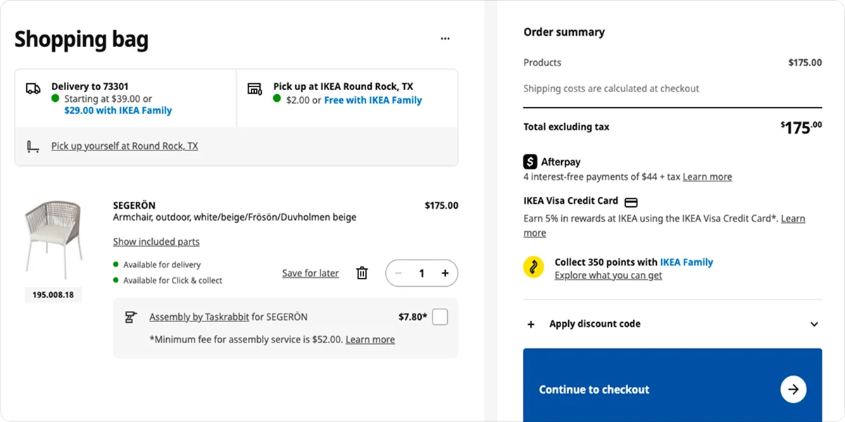
IKEA's checkout shows how much the words around a form matter.
When customers choose between delivery and pickup, IKEA doesn't list every option at once. It starts with a simple input (your location) and narrows the options from there.
Each delivery or pickup choice comes with a specific estimated date, a cost, and a short description.
The order summary follows the same logic, showing the BNPL installment breakdown, loyalty points earned on the order, and optional services, such as assembly, before customers confirm the purchase.
Why it works
At the delivery and payment steps, customers are committing to the purchase, regardless of how big or small. Every unanswered question at this point is a potential reason to abandon the order.
IKEA's copy doesn't wait for customers to go searching for answers—it puts them where customers are already looking.
The lesson
Map each step of your checkout to the question a first-time customer would have at that point:
- For delivery options, that question is usually "When will this arrive, and what will it cost?"
- For the order summary, it's "Am I seeing everything I need to know before I confirm?"
Write the copy to answer those questions directly, at the step where they come up.
5. Pre-checkout trust building (ClassPass)


ClassPass, a fitness and wellness membership platform, doesn't send customers straight to the payment screen.
Before showing the sign-up form, it walks users through three screens that address the most common objections to signing up:
- It explains what the 14-day trial includes
- No charges apply unless a late cancellation or missed reservation fee is triggered
- The plan can be adjusted or canceled at any time
Why it works
Most stores wait for customers to raise doubts before addressing them, usually through FAQs, customer service, or return policies buried in the footer. By that point, most have already decided to leave.
Seeing clear answers before the payment step reduces the mental load of committing to the payment. When the terms are already understood, entering card details feels like a formality rather than a risk.
The lesson
Most products have two or three questions that come up before customers make a purchase. Identify what those are for yours, and address them before the payment step:
- Subscription products tend to raise questions around billing transparency and cancellation terms.
- Higher-value one-time purchases usually come with questions about delivery timeframes, returns, and what happens if something goes wrong.
The earlier you answer them, the less work the payment screen has to do.
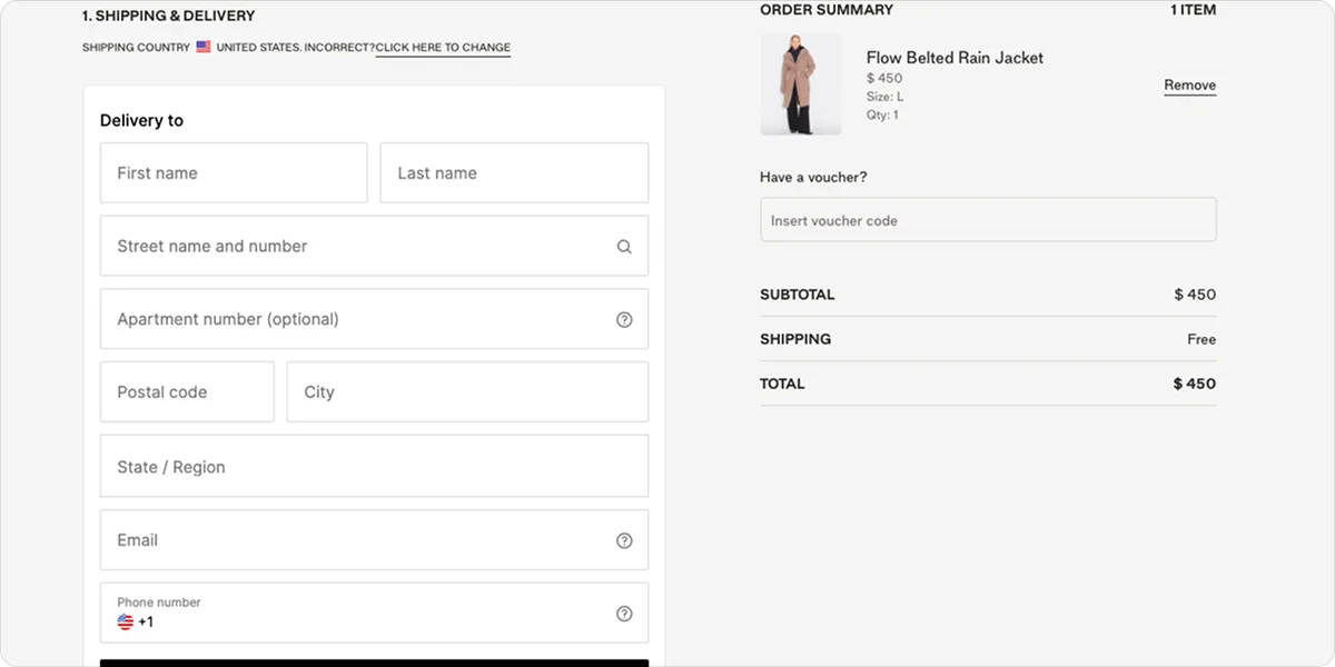
6. A shorter form, a faster checkout (Amazon)
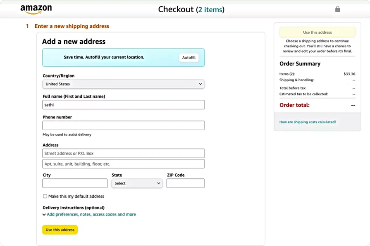
Amazon's checkout is the clearest example of what happens when you remove everything the customer doesn't need to do.
For returning customers, the address, payment method, and delivery preference are already saved. The full checkout takes seconds.
For new customers, the form is short and designed to reduce input effort from the start:
- Autofill at the top
- Name as one combined field
- Optional fields clearly labeled
The order summary also stays visible throughout, so customers always know what they're paying.
Why it works
Each unnecessary field is a small decision, and each small decision pushes customers closer to leaving. Research from the Baymard Institute found that the average checkout has 23.48 form fields, while most purchases only require 12–14 to complete.
The lesson
Audit your checkout form with the same logic. A few specific things worth checking include:
- Is autofill offered, or do customers have to type everything from scratch?
- Are the first and last names collected as one field or two?
- Are the optional fields clearly labeled so customers don't waste time on them?
- Is the order summary visible throughout, or does it disappear once customers move past the cart?
The goal is the same at every step: The less effort a customer has to put in, the more likely they are to finish their order.
7. Checkout that updates as you go (Holzweiler)
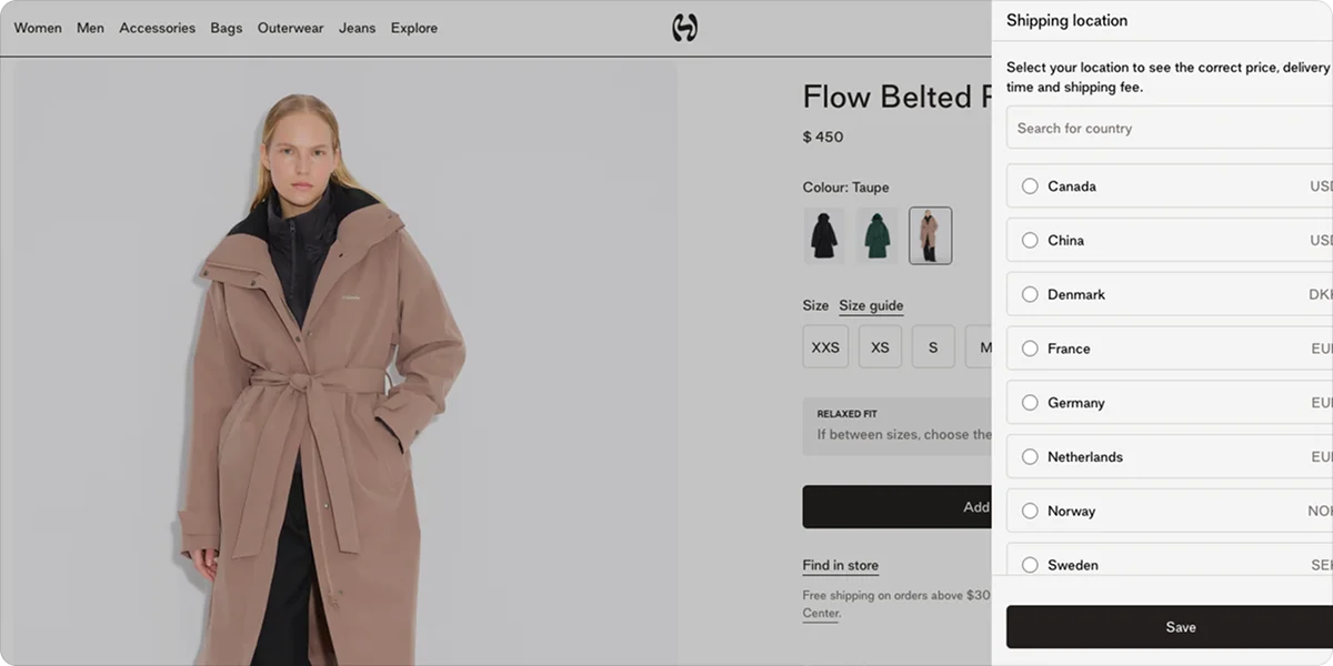
Holzweiler is a Norwegian fashion brand selling across 20 markets globally.
At checkout, the shipping country is detected automatically and shown at the top of the page. If it's wrong, customers can change it with one click, and when they do, delivery options, costs, and estimated times update to reflect the new destination. The order summary shows the full price breakdown before customers fill in a single field.
Why it works
When checkout details don't update after a country change, customers are left doing the math themselves—or they go looking for the answer elsewhere and don't come back.
Showing accurate, location-specific delivery information in real time removes a step that would otherwise slow customers down.
The lesson
If you sell across multiple countries, test what happens in your checkout when a customer changes their shipping destination. Do delivery options, costs, and times update to reflect the new country? If they don't, that's a fixable issue worth prioritizing.
Common checkout mistakes to avoid
Even small oversights in your checkout flow can cost you sales. These are the ones that come up most often:
- Forced account creation: Asking customers to register before they can buy interrupts the purchase at the worst possible moment. Many will leave rather than stop to fill out a form.
- Long forms: The more fields customers have to fill in, the more opportunities they have to stop. Remove any field that isn't essential to completing the order.
- No guest checkout: Even when account creation isn't required, not offering a clearly visible guest option has the same effect as forced registration. Make guest checkout easy to find, not an afterthought.
- Hidden fees appearing at the final step: Delivery charges, taxes, or service fees that only appear at the end are one of the most common reasons customers abandon checkout. Show the full total as early as possible.
- Unclear delivery costs: If customers can't tell what shipping will cost or when their order will arrive, they are likely to hesitate at the final step.
- Limited payment methods: Customers who don't see a payment option they recognize are unlikely to complete the purchase. Covering cards, wallets, and BNPL gives customers a reason to follow through.
- Missing mobile optimization: More than half of online purchases are now made on mobile. A checkout that's hard to navigate on a small screen loses a significant share of customers before they confirm.
What the best checkout experiences have in common
These seven examples cover different businesses, different markets, and different parts of the online checkout flow.
The best checkout experiences aren't necessarily the most visually impressive. They're the ones that remove friction, answer questions before they're asked, and make payment feel effortless.
Whether you're reviewing payment methods, simplifying forms, or improving delivery communication, even small changes can have a measurable impact on conversion.
For sellers in CEE specifically, the payment layer is often where the most sales are lost. Customers expect to see familiar methods, local currencies, and BNPL options from providers they recognize. Paypercut is built to cover that ground through one integration:
- Cards (Visa, Mastercard)
- Digital wallets (Apple Pay, Google Pay)
- BNPL aggregation across multiple CEE providers
- Multi-currency settlement across CEE markets
- Hosted checkout with your branding
- No lock-in contracts or setup fees
- Most businesses go live within 24 hours of completing the digital onboarding
If you want to see how it fits your setup, book a 30-minute consultation with the team or sign up directly to get started.
FAQ
What causes checkout abandonment?
The most common causes are unexpected costs, forced account creation, limited payment methods, long checkout forms, payment failures, and concerns about security or delivery.
Is a one-page checkout better than a multi-step one?
Neither is universally better. One-page checkouts work well for simple orders with straightforward delivery. Multi-step flows with a clear progress indicator tend to work better for complex orders where customers need to make several decisions.
The format is less important than the total number of fields and how clearly the process is communicated at each step.
How do I know which part of my checkout is losing customers?
Look at your checkout funnel in analytics and find the step with the highest exit rate. That's where you should focus first.
Most platforms show drop-off by step (shipping, payment, confirmation), so you can pinpoint whether customers are leaving because of the form, payment options, or unexpected costs at checkout.
How do I know if a checkout change helped?
Track your checkout conversion rate before and after the change, and give it at least 2–3 weeks of comparable data. Change one thing at a time so you know what actually moved the numbers.


